Episode #71, Revisions and File Versioning – How Many? is up and live!Troy, Sandy and I talk about how to set client expectations for and handle revisions.
Take a listen!Subscribe on iTunes and check out the show notes for more info.
Episode #71, Revisions and File Versioning – How Many? is up and live!Troy, Sandy and I talk about how to set client expectations for and handle revisions.
Take a listen!Subscribe on iTunes and check out the show notes for more info.

If you're in the business of setting up PowerPoint templates and need a way to create a layout in which a logo or other content always floats on top of an image placeholder, these are two hacks that will do just that for you.
And one will also let you create an image placeholder in any shape you want—not just default circles and rectangles.
One of my favorite PowerPoint hacks is to hide page numbers in slideshow mode because really, who needs to see those on screen? This simple technique can also be used to hide unreadable source notes and any other content that should be visible in printouts and PDFs, but just isn't needed or wanted on screen. Watch it here:

There's a new(ish) conference dedicated to presentation out there, and I couldn't be more excited to be a speaker at this year's Click Presentation Design Conference, June 13-14 in Seattle.
Click is a part of Creative Pro Week, a larger gathering dedicated to Photoshop, InDesign, Illustrator and other aspects of print design, run by CreativePro. Traditionally, those hard core Adobe print and digital graphic designers didn't pay a whole lot of attention to the world of presentation, so I was thrilled to see the organizers of Creative Pro Week add a couple of days dedicated to presentation design at last year's conference in New Orleans. And apparently, it was a hit, so they are again offering attendees sessions dedicated to the world of slides.I'll be giving two sessions (topics to be announced soon) and will be joining a number of other heavyweights including Julie Terberg and Richard Goring of BrightCarbon.
The complete list of speakers and more information is here, and the full conference agenda will be announced shortly. But you can register now for 1, 2, 3, 4 or 5-day passes depending on how much learnin' you want. I'm hoping to arrive a day or two prior to the start of Click in order to deepen my InDesign skills.
If you've been on the fence about attending the Presentation Summit because it might be too much presentation and not enough design, Creative Pro Week might be for you! Or if you just want to soak up as much presentation stuff as you can, I would definitely consider heading out to Seattle in June.
And if you do decide to go, let me know as I would love to meet you!
Episode #70, Presentations in the Courtroom with Kerri L. Ruttenberg is up and live!
Troy, Sandy and I welcome our first legal guest, Kerri L. Ruttenberg, to talk about trial graphics, how presentation is used in the courtroom and her fantastic book, Images with Impact: Design and Use of Winning Trial Visuals.
Kerri is a top DC litigation attorney and probably the top expert in using visuals in the courtroom in the country. I reviewed her book a while back when I first learned of it, but now we get to dive a bit deeper and hear more about the psychology of visuals, what can and can't be used in a courtroom and what the state of the trial graphics industry is.
Even if you never plan on working in this area of presentation design, this is a really good conversation in which you'll learn a ton not just about how to convince juries with visuals, but how to convince your own audiences.
Take a listen!Subscribe on iTunes and check out the show notes for more info.
Episode #67, There Are No Mistakes (with Travis Thomas) is up and live!Troy, Sandy and I welcome Travis Thomas from LiveYesAnd for a discussion on how to live with presentation mistakes and what can be learned from the world of improv comedy.
Take a listen!Subscribe on iTunes and check out the show notes for more info.
The New York Times has been using the below graphic style for a lot of their recent political coverage. They didn't invent this look, of course, but I really like it and wanted to show how you can recreate this effect all within PowerPoint in a just a few steps.

Episode #64, International Perspectives on PowerPoint is up and live!We took advantage of the recent Presentation Summit to gather a group of presentationists from across the globe. Take a listen!
Subscribe on iTunes and check out the show notes for more info.
My friend Lori Chollar of TLC Creative gave a talk on typography for presentations at the recent Presentation Summit, but my favorite part is her History of Typography (in 60 Seconds).
Take a look—I know you have the time...

One of the questions I get asked most often is how can an average user create professional-looking infographics in PowerPoint. There are very good sites like Diagrammer, Canva and Infogram that can all help with providing and assembling elements of an infographic. And yes, you can always resort to PowerPoint's own SmartArt, but unless you use it simply as a starting point, it's going to look like...well, SmartArt. The disappointing truth is that to produce a professional looking infographic, you generally need to hire a professional. Enter Mike Parkinson and his brand new Build-a-Graphic add-in for PowerPoint.
Mike Parkinson runs Billion Dollar Graphics and is one of those professionals that has been creating custom infographics for high profile clients for years. He's got an excellent book on infographics and a brand new one on PowerPoint, but he has also just introduced Build-a-Graphic, a killer add-in for PowerPoint that allows any user to call upon a massive library of pre-made (professionally designed!) vector graphics all from within PowerPoint. If SmartArt is a tricycle, Build-a-Graphic is a Ferrari.
But it gets even better. Because while you can simply search through the catalog of ready-to-use graphic and insert them onto your PowerPoint slides, the tool can also examine your slide's content for you, automatically convert bullet points to more readable visual chunks and then suggest specific graphics relevant to your material. The quick demo below shows all this in action.
And all graphics are made up of pure PowerPoint shapes and vectors which means they are completely customizable, recolorable and can be taken apart however you like.
It's not an exaggeration to say that now that anyone can have professionally designed customized graphics with just a few clicks of the mouse.
The Build-a-Graphic add-in is a $99/year subscription which includes ongoing updates and additions to the graphic catalog. PC only for right now.
Episode #63, Live From the 2018 Presentation Summit is up and live!We gathered a bunch awesome people and turned the mic on at last week's Presentation Summit in San Diego...
Subscribe on iTunes and check out the show notes for more info.
Episode #58, Women Owned Presentation Businesses is up and live!Troy and I get kicked out of the room this week while Sandra welcomes guest hosts Lori Chollar and industry legend Nancy Duarte to discuss presentation businesses that are owned by women.
Subscribe on iTunes and check out the show notes for more info.
Episode #57, Do You Like PowerPoint Sections? is up and live!Yes: Sandy, Troy and I fill a whole episode on this one subtle, but incredibly useful feature.
Subscribe on iTunes and check out the show notes for more info.

The majority of PowerPoint users probably have no idea that the program can work much better than what Microsoft gives you out of the box through the use of third-party add-ins. Corporate clients can have complex and custom functionality created for them including content libraries, charting macros, branding tools and much more. But the same people who create those corporate add-ins also create commercial tools for the average user. And unlike some plugins for other programs such as those by Adobe, PowerPoint add-ins tend to be relatively dirt cheap.On the Presentation Podcast, we recently did a two parter, interviewing three of the industry's leading PowerPoint developers, Jamie Garroch of YOUpresent, Gil Segal of ToolsToo and Steve Rindsberg of PPTools.
In those episodes, we barely talk about PowerPoint add-ins for the Mac because historically they have been nearly non-existent. But now, Jamie Garroch has developed his brand new YOUtools add-in to work and updated his to work on BOTH Mac and PC. In fact, it's not even two separate files, but a single file that you can choose to install on either platform you choose. That alone kind of baffles me.
Jamie is continuing to refine the tools, but they are now on sale. And if you consider your time to be as valuable an asset as I do, the $29 price tag is a no-brainer. The Setup Guides tool can now do in seconds what once took 30 minutes or more.Any catches? Yes, unfortunately there are a few items that are not currently supported on the Mac because Microsoft hasn't opened up the required features on that platform. And that awesome Setup Guides tool is the major feature that will not appear in your toolbar when installed on a Mac. For now...
Below are the ribbons you'll see on the PC...

and on the Mac...

In addition to much more powerful alignment tools, you get Table tools which can help with sorting and conversion to text, Text to Outline which quickly turns live text into shapes and Export tools which includes a feature I have been wanting for years: Export to Webinar. This allows you to create a new, webinar-friendly version of your presentation that strips out and identifies items such as animation, transitions, video and more.
The two most powerful tools are undoubtedly (1) Setup Guides which allows you to set margins like a pro and add those margins as PowerPoint guides with absolute precision.

And (2) Theme Colors which gives you incredible granular control of creating and editing your color palette. This is going to be a lifesaver for anyone who regularly creates custom templates. I just used it yesterday and probably saved 10 minutes.There's more in the suite than even I'm mentioning here, and I have no doubt that the toolset will get more robust in time.

And as I said, at $29, it's beyond a bargain.
Episode #54, A Conversation with PPT Add-in Developers (Part 2) is up and live!Join Sandy, Troy and I along with three of the biggest names in PowerPoint development: Gil Segal, Jamie Garroch and Steve Rindsberg.
Subscribe on iTunes and check out the show notes for more info.
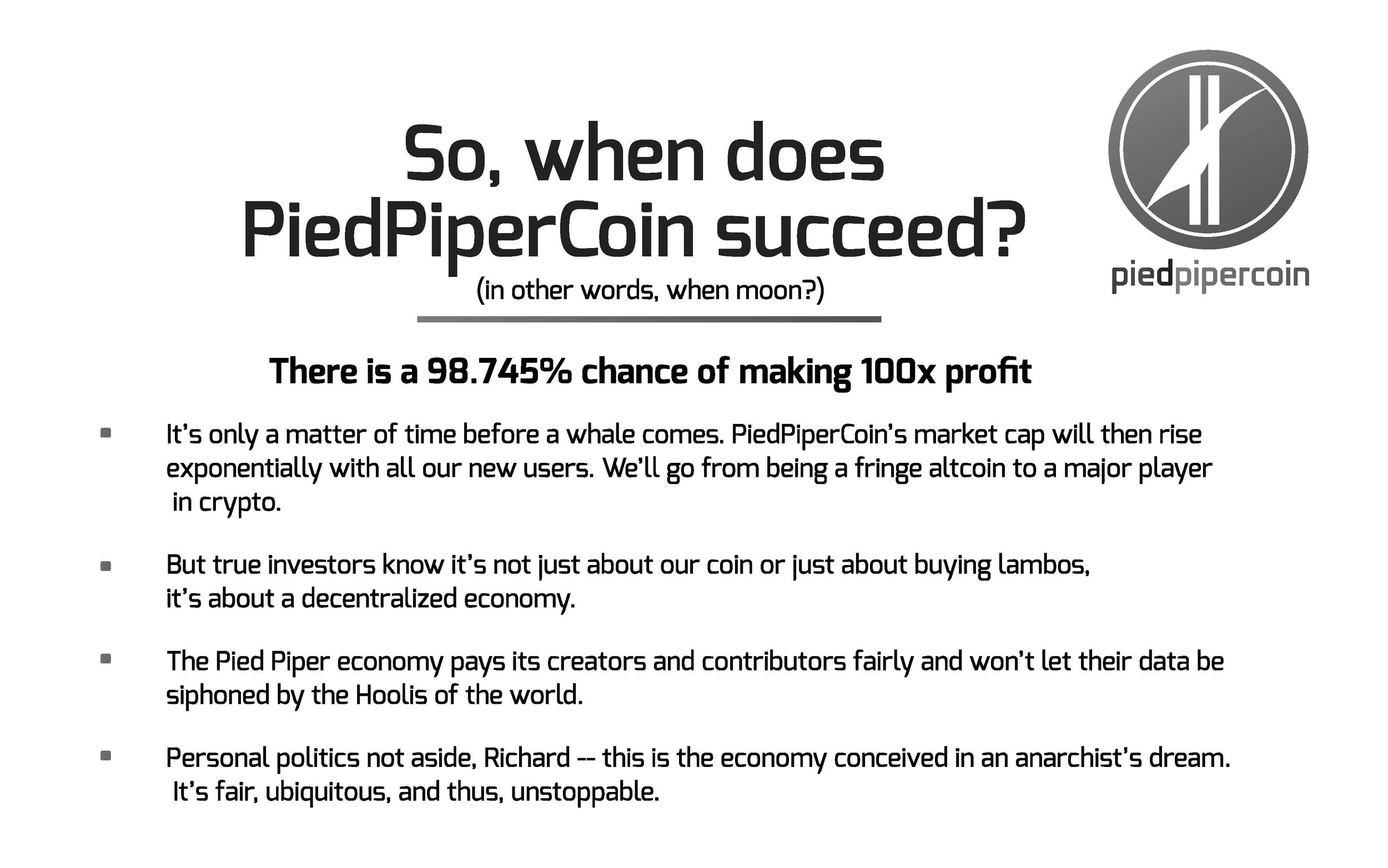
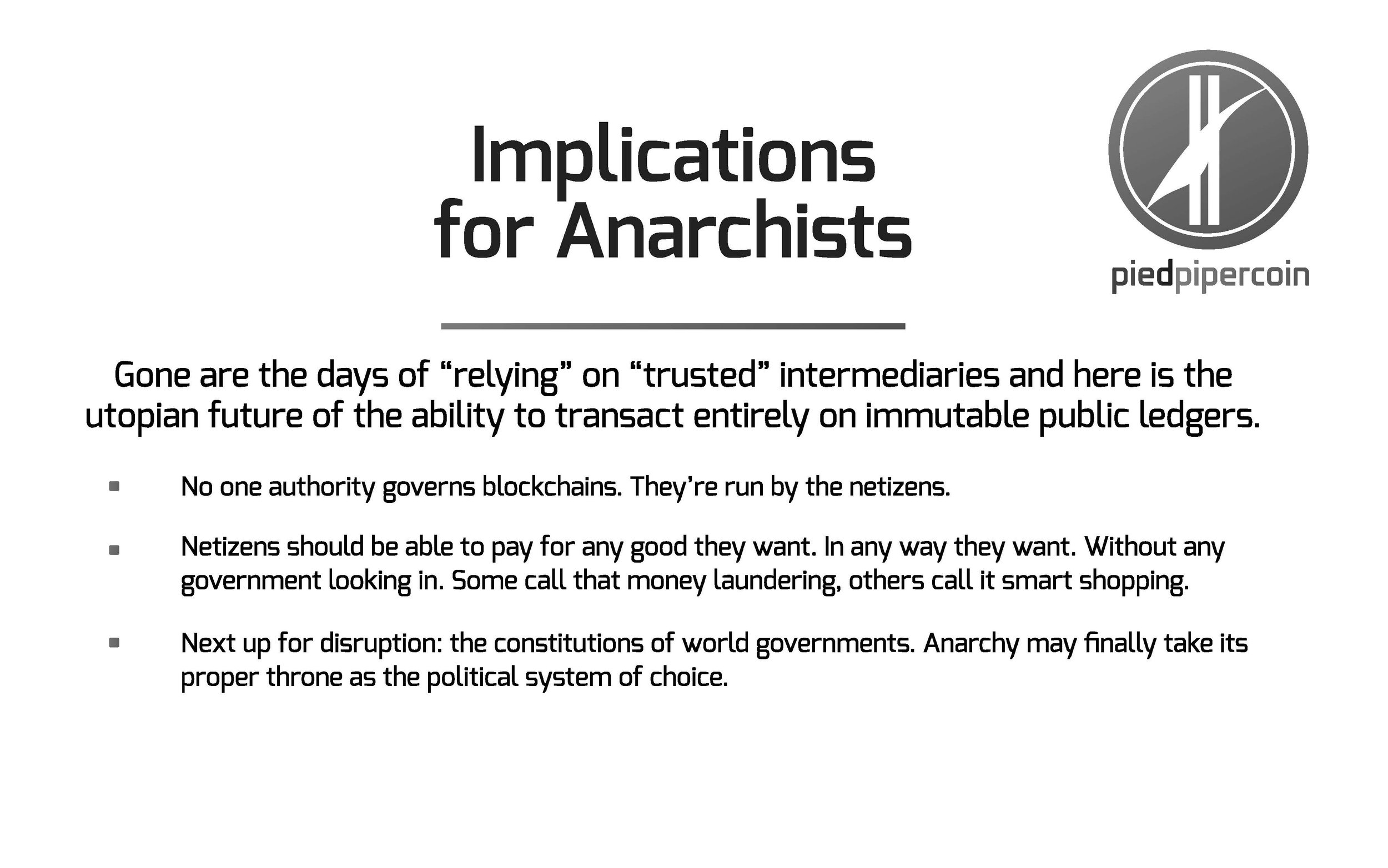
We only caught a few glimpses of Gilfoyle's presentation on crypto currencies in the last episode of Silicon Valley, but PiedPiper.com posted the entire thing. Take a look here!


Episode #53, Using Color in PowerPoint is live!This week we're getting granular on using (and not mis-using) the color palette. Lots of really good links in the show notes too!Subscribe on iTunes and check out the show notes for more info.

Factfulness by Hans Rosling is significant attention as well it should be. Of course, Bill Gates saying it is "one of the most important books" he's ever read doesn't hurt.
Like any reader, I imagine, I had my eyes opened continually about misconceptions about the world--which is the intent of the book. But, I'll always remember Hans Rosling not only for what he said, but how he said it. His TED Talks are famous for his energy, but also for the demos of his Gapminder software that animates bubble charts. Rosling was able to visualize data in such an accessible way, and I wanted to point out two of my favorite examples of how he implemented visual storytelling in Factfulness.
The book is premised on the survey results to a series of questions that Rolling asked audiences all over the world. Predictably, no matter what their education or background, people fundamentally have misperceptions about the world and facts. Each question only has three possible answers, and he makes the point over and over that even a chimpanzee answering the quiz will get on average 33% correct answers. But as we see, even the most educated audiences often score lower than a random guess because of bias. And so, Rosling will add in on the x-axis a "Chimp Point" showing were random correct responses should lie. Here's an example.

Much of the book revolves around the four income levels as defined by the World Bank which breaks down essentially as:Level 1: $1/dayLevel 2: $4/dayLevel 3: $16/dayLevel 4: $64/dayYou could chart or describe with words these four levels in a million different ways, but Rosling breaks it down to the simplest explanation with pictures of what it means at different levels to sleep or eat or brush your teeth. Here's a grid showing just what it means...It's a good and fast read, and I definitely recommend it.And if you want to make animated bubble charts a la Rosling, you can do so in PowerPoint with this hack.

Episode #51, PowerPoint Add-ins We Like is live.Stay tuned for bonus episodes with developer interviews...
Subscribe on iTunes and check out the show notes for more info.
Finally, support for SVGs has come to Mac for PowerPoint (O365 Insider Fast for now only.)
For Noun Project users, you can now download the SVG versions from the website for use in PowerPoint, although many will still find it easier to use the built-in PowerPoint add-in for Noun Project that still inserts PNG versions.

Still missing is the ability to break apart inserted SVGs so that they function as true shapes—something available to PC users. But now you can add effects, apply any color fill and, of course, scale to any size. You'll save on file size as well with SVGs.


