It's long overdue, but as we're in a new year and hopefully very new age, we have completely redesigned and relaunched NolanHaimsCreative.com, the business arm of this whole presentation thing we do.Take a look and learn how we work with brands big and small to communicate more visually and with fewer words.
The The Let's Hear It! Podcast is covers the world of foundation and nonprofit communications, and I have known Eric Brown, one of the hosts for more years than I can count. So I was excited to be asked on as a guest to talk about effective presentation design with a particular bent towards the nonprofit world which I have been working in for as many years as I have known Eric.
It's a great and funny conversation that has covering a lot including why you want to "make your content like a Twinkie."
Take a listen!
Episode #80, Should You Use Canva for Presentations? is up.Troy, Sandy and I get our hands dirty playing with Canva and creating a sample presentation. Is the online software ready for primetime when it comes to presentation or is it still best left as a social media graphics creator? Tune in to find out our thoughts...Take a listen!Subscribe on iTunes and check out the show notes for more info.
One of my favorite PowerPoint hacks is to hide page numbers in slideshow mode because really, who needs to see those on screen? This simple technique can also be used to hide unreadable source notes and any other content that should be visible in printouts and PDFs, but just isn't needed or wanted on screen. Watch it here:
Episode #70, Presentations in the Courtroom with Kerri L. Ruttenberg is up and live!
Troy, Sandy and I welcome our first legal guest, Kerri L. Ruttenberg, to talk about trial graphics, how presentation is used in the courtroom and her fantastic book, Images with Impact: Design and Use of Winning Trial Visuals.
Kerri is a top DC litigation attorney and probably the top expert in using visuals in the courtroom in the country. I reviewed her book a while back when I first learned of it, but now we get to dive a bit deeper and hear more about the psychology of visuals, what can and can't be used in a courtroom and what the state of the trial graphics industry is.
Even if you never plan on working in this area of presentation design, this is a really good conversation in which you'll learn a ton not just about how to convince juries with visuals, but how to convince your own audiences.
Take a listen!Subscribe on iTunes and check out the show notes for more info.
Entirely impractical, but there's something aesthetically beautiful about these simplified maps of various subway and train lines around the world.
h/t to Kotke
While I can't say I'm happy about the data behind this chart from the NY Times (increasing murder rates across the country), I do love the simplicity of design.
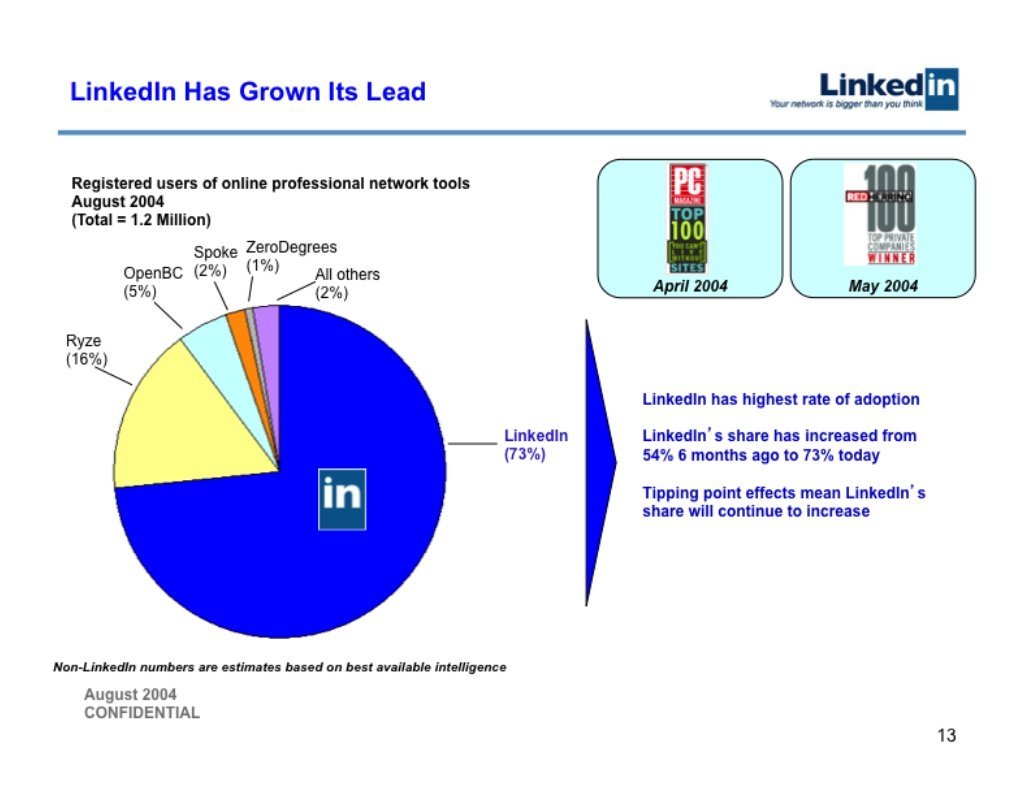
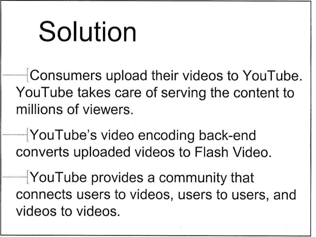
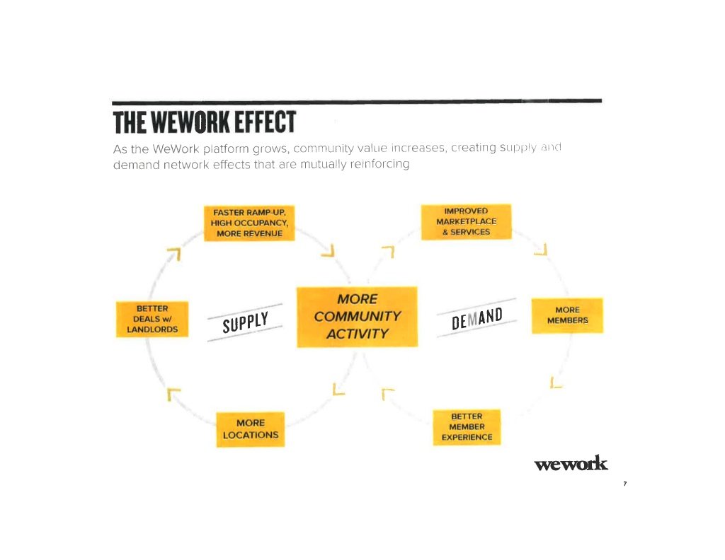
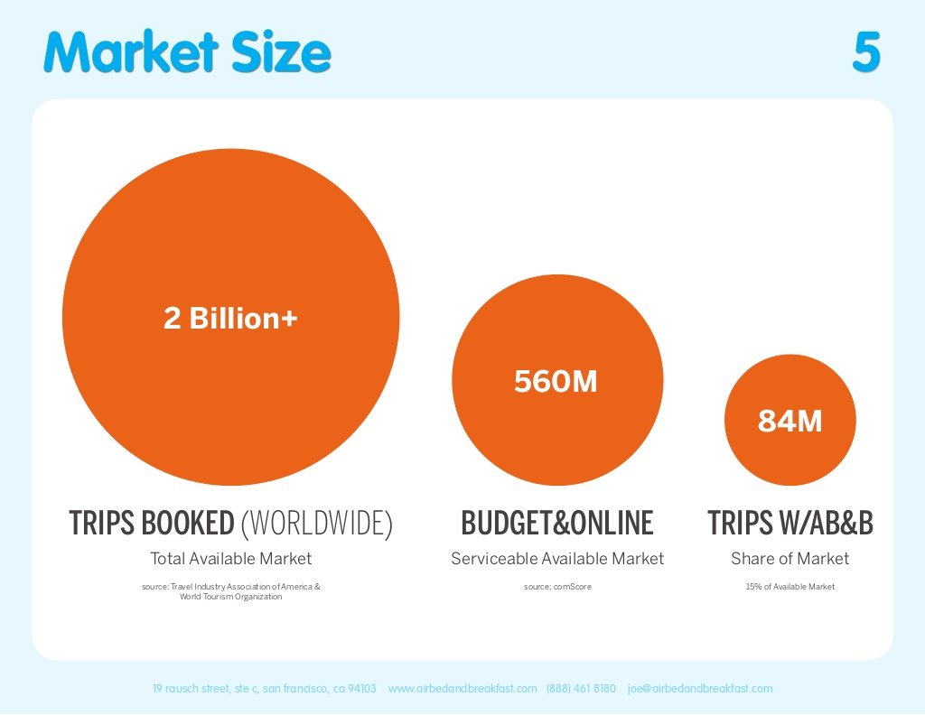
Attach.io has posted 15 startup pitch decks from companies big and small, but all the resulted in raising significant capital.There's some good here (Airbnb) and some horrendous (YouTube), but design aside—and I usually never say that—what is to be learned from these is the simplicity of messaging and limited content.
As Guy Kawasaki has said, if you can't explain your business in ten slides, you don't understand your business and I don't want to invest in it.
Check out all the decks here.
Corporate advertising on the back of a celebrity death? Check. But this Chevy tribute to Prince is undeniably beautiful from a graphic design perspective.
It is still true what they say: Nobody writes songs about Volvos.
You know I love great stories told without words. And this one from the always creative New Yorker hits it out of the ballpark.
Guy Kawasaki has long said that he would never invest in a business that couldn't make its case in 10 slides. While I'm no venture capitalist like Guy, I've seen plenty of pitch and investor decks that had no hope of getting investment—and one of the common themes was far too many slides. When you don't understand your business well enough to explain it simply, or if your business model is so complicated that it can't be explained simply, then why would an outside want to invest?Guy revisits his 10-slide maxim in the below Entrepreneur article.
 If there's one thing drives me crazy, it's seeing people putting together and designing a presentation before they even know what they're trying to say. Often, this cart-before-the-horse approach is the result of laziness and simply not wanting to outline a story first. But I also see cases where presenters are literally trying to generate business ideas and solutions at the same time they're deciding what font color to use. This couldn't be more counterproductive to successful ideation, and it shows me yet again that idea generation is a vanishing art."Innovation" is what leaders say time and again is most important to their businesses, and yet few of us know how to actually generate and select innovative ideas—be it an iPhone or a better way for signing up for the office softball team.
So, how do you successfully ideate?
I've written before about the book SmartStorming which I still consider the single best book I have ever seen on this topic. The authors, Keith Harmeyer and Mitchell Rigie (good friends and former colleagues, full disclosure) are simply the best in the business when it comes to helping others generate new ideas and innovate.Until now, the only way to learn their secret sauce was through their book or by attending a private corporate training. That changes with the introduction of their new SmartStormer online training available to all. Adapted from their in-person trainings, the 5 1/2 hour course contains interactive exercises, quizzes and 70 high-quality videos. It is essentially the online version of the full day SmartStorming training. And yes, it definitely contains their secret sauce to ideation. If you feel like you struggle with coming up with "good ideas" and wonder how others can brainstorm 20 ideas vs your three, I highly encourage you to take a look. The course is modular and can be accessed for up to a year, so you can definitely go through it at your own pace.The cost to the public is $299, but use the special Present Your Story code of PYS50, and you'll receive a $50 discount. And if you're interested in a group discount for your office, just give them a holler—I'm sure they'll cut you a good deal.Find out more here and even try a free sample. And if you need more convincing, head over to 3 Questions with Keith.
I couldn't find the source of this data from Oxfam, but I love the simplicity of adding a visual to the numbers on this line graph.
 I came across a simple, but excellent example of process graphics in Michael Bierut's new book, How To. Above are two pages from the printed brand guidelines for the design of United Airline's once low cost sub-brand called TED.As part of the design and branding work, Michael's firm Pentagram wanted to show how the different divisions of United Airlines all fit together. Instead of a single visual ("process graphic"), they created two: one for internal audiences (on the left) and one for external audiences (on the right.)This is a great reminder for me that one story does not always mean one single graphic. Think about your audience, think about their level of knowledge, think about what you want them to take away from your graphic.Below is the full page from Michael's new book.
There has been an increasing trend in companies these days of insisting presentations be limited to just a few slides. I'm hearing more and more from clients that bosses are demanding "5 slides only" or "10 slides maximum" for an internal presentation.So, what does this actually mean and how do you handle a situation like this?
Slide Number Agnostic
First of all, I have always been slide number agnostic. For an on-screen presentation, it makes no difference if you present 10 minutes worth of content with one slide or with 20 slides. In my trainings, I routinely use upwards of 100 slides per hour. But herein lies the clue for you when given a cap on number of slides. Anyone who asks you to limit your number of slides is actually asking you to limit and focus your content. Most people assume content is related to slide number the way that a newspaper article is related to word count. But it's just not true. It's quite possible to put 60 minutes of content onto 5 slides—and that's precisely what some people do...
It's About Time Allotted
The first step in answering this challenge is to truly examine how much time you have to present. When preparing a presentation, overall time and time per slide are two of the most important metrics to consider. If you're given 5 minutes to present next year's sales strategy, that's a pretty good indication that this is not the place to discuss the work history of your 25 new sales reps and the 15-phase implementation plan for the new B2C website. Given 5 minutes, you can only address the big picture and the actionable takeaway, if any.
They Just Want the Big Picture
And that gets us to what most people are actually asking for when they ask for a cap on slides. They simply want the big picture and the takeaway. But for whatever reason, corporate America has failed time and again in adequately expressing and teaching people how to deliver this. Raise your hand if you've ever delivered more than you knew you were asked for. Why did you do it? Well, nobody has ever been fired for including too much...So, let's accept some collective blame here, and now understand why you are being limited to 5 slides only. It is a clumsy attempt to force people to not put needless details up on the screen.
So How Do You Handle the Slide Cap Request?
Clarify the presentation's objectives with whoever has requested the slide cap. Talk in terms of time allotted to present and ask what level of detail and takeaway is required. In most cases, people don't want all the detail behind the overall message. If it seems as though the requested information can fit into the allotted time, but is still more than what will comfortably fit on 5 slides with one message per slide, then ask for an exception and explain why. If the requested information is too much for your allotted time, then ask to provide additional content in a handout that will never be projected. Detailed tables and endless research notes have a place—just not on the screen in a live presentation. And keep in mind:
"5 Slides Only" = "Just Give Me the Big Picture"
Yesterday I had a structural carpenter come out to our house to look at a small issue we needed taking care of. This guy came highly recommended, and I couldn't have been more impressed. He's apparently the go-to guy in this area for this type of work, and it was clear he knew what he was talking about.
Then he handed me his card, and I was taken aback by the seemingly juvenile stick figure drawing. I'm used to seeing poorly designed business cards and in this day and age, and I actually I think they are far less important then they used to. (For the community in which this guy works, I think his Facebook page probably gets him far more work than his business card.) But still, I kept thinking that this guy needs a better calling card. Literally.
Then I showed it to my wife (who knows a thing or two about design and marketing), and this was her response:
"Doesn't it tell you exactly what he does?"
I had no argument. And instantly, this juvenile stick figure drawing (maybe it actually was drawn by his kid which would be adorable) on the business card of a very successful expert has become one of my favorite examples of effective simplicity.
In just a few pen strokes, here's a visual story that says: "I reinforce and make houses structurally sound."
But it probably wouldn't be a good card for a professional illustrator...
I thought the above chart on the left was interesting, if not quite as effective as another chart might be. Most would have jumped to a pie chart, or maybe a stacked bar chart, but the WSJ today created a..."Dot Bar Graph"? I don't know what you'd call it, but it did take me a moment to figure it out as a reader. And then after I did figure it out, second guessed myself due to the removal of the %'s after 40%. (Were there only 27 women polled, I wondered?)
After a few moments, I realized that all the numbers (which are percentages) add up to 100%—something that is not so intuitive since the scale ends at 40%.
Perhaps they didn't want to do a bar graph (which is perfectly acceptable when all values add up to 100%) so as not to confuse things with the bar graph on the right?
So, in the end, it's "interesting" to me. But maybe a stacked bar chart or tree map would have been better?
Many of you know that I'm a big fan of a little-noticed addition our President has made to the age-old tradition of the State of the Union address. The White House has recognized the visual, media-hungry, short attention span society we have become and has responded by adding slides to the President's annual address of Congress and the nation.
No, there are no screens behind the President, and if you watch on TV, you won't see the slides. But if you watch online in real-time or afterward, you can view the Enhanced State of the Union that includes composite video of the President and a sidebar of vertical visuals (slides) that hit key points of the President's speech.
As usual, not every slide is perfect (really, they have got to lose the red text over blue backgrounds...), but I have noticed the visuals getting better each year. And what I noticed most of all this time was an increased use of imagery. The slides continue to become simpler and more effective for communicating their message in fractions of a second.
And if you just want to view the slides, they are on SlideShare.
