I recently discovered a fantastic podcast on speaking and presentation from down under called The Presentation Podcast, hosted by Thomas Krafft and Kate Norris.In a unique approach, they rotate weekly among three different formats: An interview with a figure in the presentation or speech world, a speech breakdown in which they play a speech by a public figure and critique it, and an topic episode in which they cover a particular aspect of presentation.I was on this week's installment, Episode #64. Check it out here!
Episode #93, Investing in Our Presentation Design Business is up!Troy, Sandy and I kick the new year off with a discussion on just where we put our money to invest in our presentation businesses—everything from what's physically in our offices to software and subscriptions.Take a listen!Subscribe on iTunes and check out the show notes for more info.
Episode #92, Our Presentation Year in Review 2019 is up!Troy, Sandy and I run down the best and worst of 2019 in the world of presentation and talk about our favorite books, add-ins, projects and events.Take a listen!
Subscribe on iTunes and check out the show notes for more info.
Episode #87, When Scientists Present (Conversation w/ Mike Morrison) is up.
Troy, Sandy and I welcome Mike Morrison, someone who has been making some waves in the world of scientific presentation with his proposals for better and differently designed science posters.We have a wide ranging talk about how scientists present, how they can present better and why graphic design might be the key to curing cancer—well, kind of. But you'll have to listen to hear more about that.Take a listen!
Subscribe on iTunes and check out the show notes for more info.
PowerPoint’s Format Painter can save you endless hours with shapes and text boxes, but it doesn’t work on charts. There is, however, a method to save and paste design formatting from one chart to another. So, let’s dive into the mysterious world of Chart Templates and .crtx files.
We’ll start with data sets for the highest paid athletes in 2018 and 2017 and a default chart style (click the images below for a closer look)...
Continue reading the entire article over at CreativePro.com.
And don't forget, I'll be speaking at CreativePro's CreativeProWeek Click Presentation Conference in June in Seattle! (Discounted registration available until April 15!)
Stephanie Evergreen will soon be out with another book for the data visualization community (to coincide with the second edition of her phenomenal first book Effective Data Visualization). This one is called The Data Visualization Sketchbook, and in it Stephanie gives readers multiple templates for use in assembling data reports, handouts, dashboards, presentations and more.The templates and overall approach are a nice reminder that diving into Tableau or Word or PowerPoint is not always the best or most efficient course of action. Sometimes getting pencil and paper out helps organize your data and information and simplify your message.Below are a couple of Stephanie's templates I used to prep for an upcoming data report project.
Take a look and also take a look at Stephanie's site for tons of great info on visualizing data.
Factfulness by Hans Rosling is significant attention as well it should be. Of course, Bill Gates saying it is "one of the most important books" he's ever read doesn't hurt.
Like any reader, I imagine, I had my eyes opened continually about misconceptions about the world--which is the intent of the book. But, I'll always remember Hans Rosling not only for what he said, but how he said it. His TED Talks are famous for his energy, but also for the demos of his Gapminder software that animates bubble charts. Rosling was able to visualize data in such an accessible way, and I wanted to point out two of my favorite examples of how he implemented visual storytelling in Factfulness.
The Chimpanzee
The book is premised on the survey results to a series of questions that Rolling asked audiences all over the world. Predictably, no matter what their education or background, people fundamentally have misperceptions about the world and facts. Each question only has three possible answers, and he makes the point over and over that even a chimpanzee answering the quiz will get on average 33% correct answers. But as we see, even the most educated audiences often score lower than a random guess because of bias. And so, Rosling will add in on the x-axis a "Chimp Point" showing were random correct responses should lie. Here's an example.
The Picture Superiority Effect in Action
Much of the book revolves around the four income levels as defined by the World Bank which breaks down essentially as:Level 1: $1/dayLevel 2: $4/dayLevel 3: $16/dayLevel 4: $64/dayYou could chart or describe with words these four levels in a million different ways, but Rosling breaks it down to the simplest explanation with pictures of what it means at different levels to sleep or eat or brush your teeth. Here's a grid showing just what it means...It's a good and fast read, and I definitely recommend it.And if you want to make animated bubble charts a la Rosling, you can do so in PowerPoint with this hack.
Always fun coming up with a pie chart alternative as fast as you possibly can move your mouse.
I'll call this one a...Collapsing Diamond Waffle chart?
Have a deck full of awful, tired pie charts that aren't cutting it? Embarrassed by your monthly sales dashboard? Can't get your boss to spring for a professional makeover of your signature SEO results?
Here's the deal
I train organizations all over the country on how to better communicate their data and create effective data visualizations. And for a short period, I am providing completely free makeovers of existing charts for you and your organization.
Here's the catch
I'm making this offer to obtain new real-world examples of data sets and visualizations for use in my trainings. So, in exchange for my design work, you agree to allow me the use of the data and makeovers however I choose."But my data is sensitive and proprietary!" No problem. I'm happy to:
Sign any required NDAs.
After delivering your makeover, scrub charts of identifying data, logos, color and information resulting in a "generic" version for which you will grant final written approval for me to use.
Note: You must be capable of providing such final approval for your organization...
What else?
I'll look at any data and existing charts, but am most interested in those related to marketing, media, advertising, digital research, sales and any work by agencies.
I'm looking for challenges and diversity of information, so I probably won't be interested in making over 100 identical column charts of monthly sales.
My focus is on simplicity of messaging and charts that the average user can create using typical tools; if you're looking for interactive "data art," that's not me.
I reserve the right to decline any project or portion of project for any reason.
I do need to work around paying projects and trainings, but won't leave you hanging forever.
Contact me at nolan@nolanhaimscreative.com, and feel free to forward this offer on to anyone else you know. First come, first served!
Fellow PowerPoint MVP Glenna Shaw has a nice article up on Microsoft on using Excel to visualize time including creating accurate timelines and clock charts.
Take a look!
Always read the footnotes!Thanks to Alberto Cairo for a footnote in The Truthful Art pointing me to this small paper by Michael Friendly on Charles Joseph Minard and his famous graphic of Napoleon's disastrous 1812 Russian march.
Via Storytelling with Data, take a look into 60 makeovers to this original chart from The Economist:
I'm really excited to be attending "Visual Trumpery," a talk by Alberto Cairo hosted by the NYC Data Visualization Meetup group.If you're not a member of the Meetup group, you can register on Eventbrite here.
Spread the word!
There's a new podcast in town all about data and technology and how it shapes our world. And guess what? I'm the inaugural guest for episode 1.
Data Talks is hosted by Ashutosh Nandeshwar, an analytics guru, PhD and data specialist.Take a listen as we talk about visual storytelling and make sure to subscribe and rate it.
And if you aren't a subscriber to The Presentation Podcast, um...why aren't you a subscriber to to The Presentation Podcast?
I love Bullet Graphs and loved this guest post by Billy Dean over at Storytelling with Data.
In my training sessions, I teach people how to turn a dreaded clustered column chart into a bullet graph with just a few clicks. If you haven't used them, you should be...
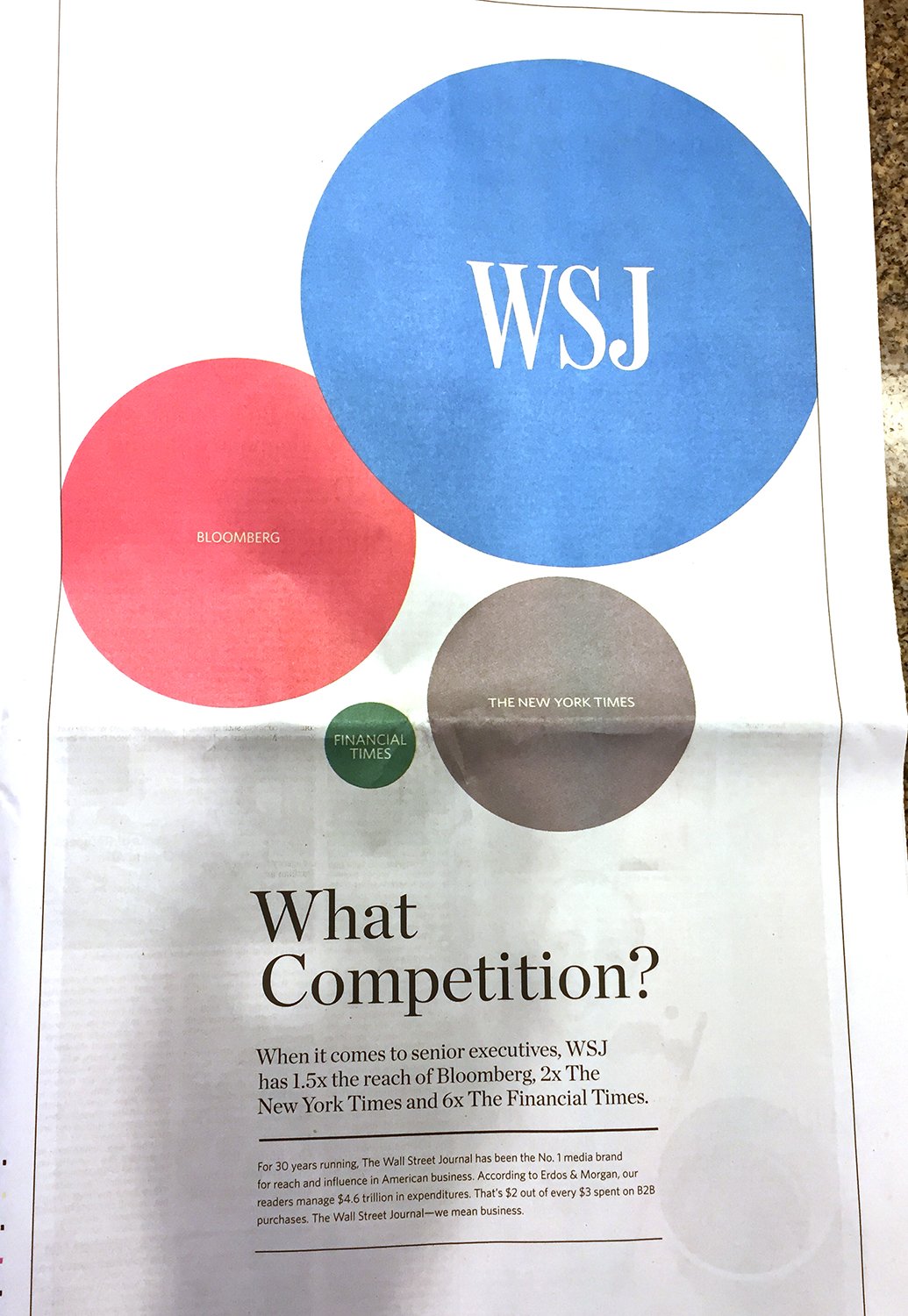
Ugh. The deceptive proportional shape rears its head again, this time courtesy of a Wall Street Journal ad I saw this weekend in the print edition. And to be clear, this is an add FOR The Wall Street Journal.
Any average reader looking at the above ad would know instantly that The Wall Street Journal dwarfs its competitors when it comes to reaching senior executives. But any data visualization professional (or mathematician), would know instantly that the Journal is being incredibly dishonest with their graphic. Why? Because the Journal is using the diameter of the circles as comparison rather than the area. And when you use the diameter, you're exaggerating and essentially telling a visual lie because of how readers process a chart like this.If you read the detail lower in the ad, the claim is made that WSJ has twice the reach of The New York Times. But when readers see sized circles, they assume the area of the circles is the indicator of the amounts being compared. We can do a quick test to see that that assumption would be completely wrong.:
Overlaying The New York Times circle on top of the WSJ, we see that nearly four of the Times's audiences would fit into that of the WSJ.
But wait, the WSJ only has twice the audience reach, right? Why is their circle so massive? Because...the WSJ wants to make their audience reach look much larger than it actually is. They want to use data visualization to fool readers into thinking they are even better than the Times in this metric than they actually are. And they do this by using the diameter of the circles.
Yes, the diameter of the WSJ is 200% that of the Times. But that's not how these things work.
A proper use of proportional shapes for this data would look something like this:
To make matters worse, Microsoft doesn't do the world any favors by tacitly allowing this kind of data deception. I can't speak for other data visualization software, but PowerPoint and Excel allow the user to choose either area or width when creating bubble charts--a type of proportional shape visualization.
If you're a user of Excel and PowerPoint, you can use bubble graphs to create proportional shapes for you and break apart the charts into shapes using some hacks, but a far easier way to create properly sized proportional shapes is to use my Proportional Shape Calculator tool--a simple Excel calculator you can download from the goodies page on this site.
Elijah Meeks (Data Visualization Engineer at Netflix) put together a survey on data visualization, but what I really liked was his below solution for those impossibly crowded stacked bar charts. This may be an output of some data software I don't use, but you could certainly do this in Excel with a little extra manual work.
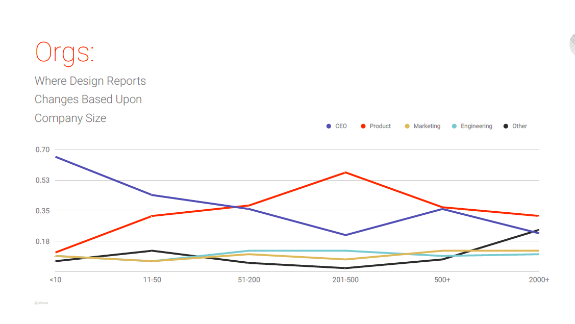
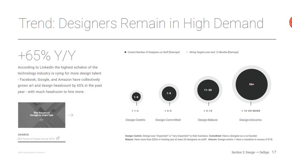
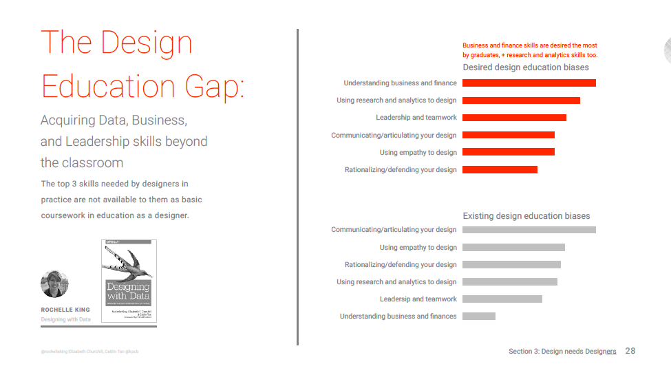
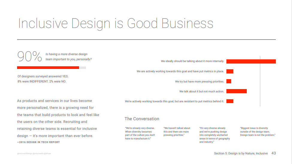
Interesting insights into state of design from John Maeda.
Download PDF from Slideshare as slideshow rasterizes horribly.
And interesting poor data design practices. Come on, percentage axes not labeled as "%", missing axes, those sized circle things, legends...There is a point where removing too much from a data visualization causes is to take longer to read.
