

When was the first emoticon created? 1881, apparently, in Puck Magazine.H/T to Brain Pickings and to 100 Diagrams That Changed the World, that is on its way to me from Amazon right now.


Holy cow, look at these incredible hand-drawn data visualizations by W.E.B. Du Bois from 1900.
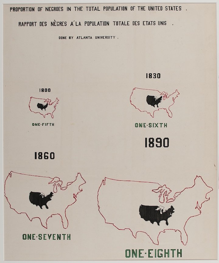
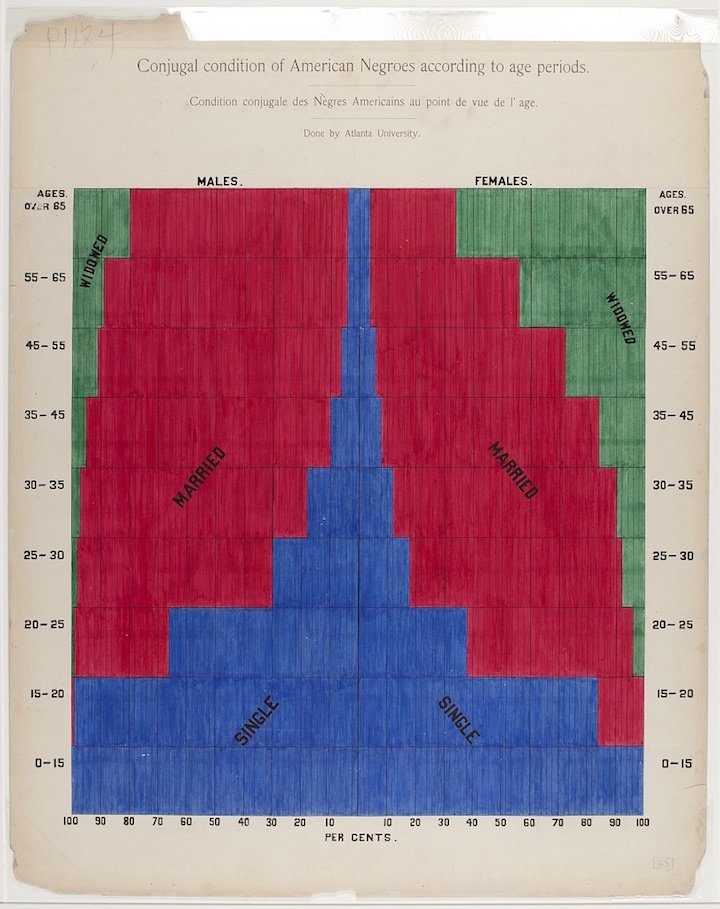
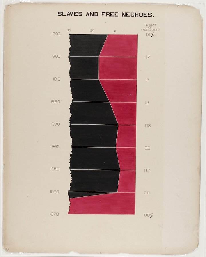
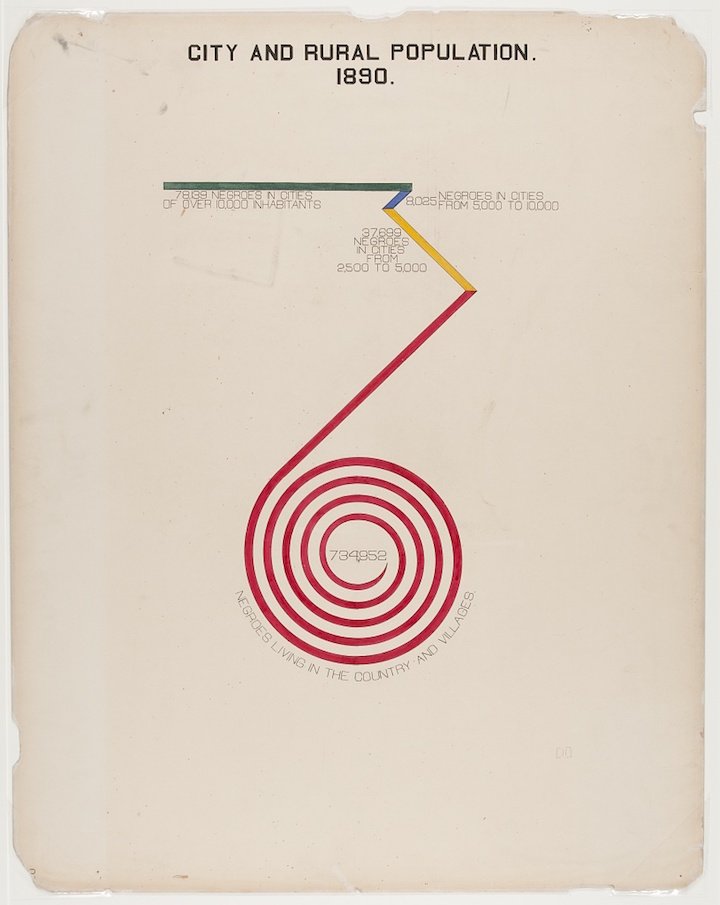
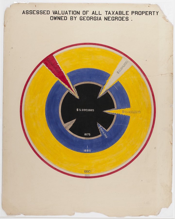
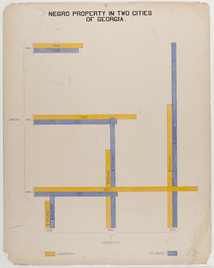
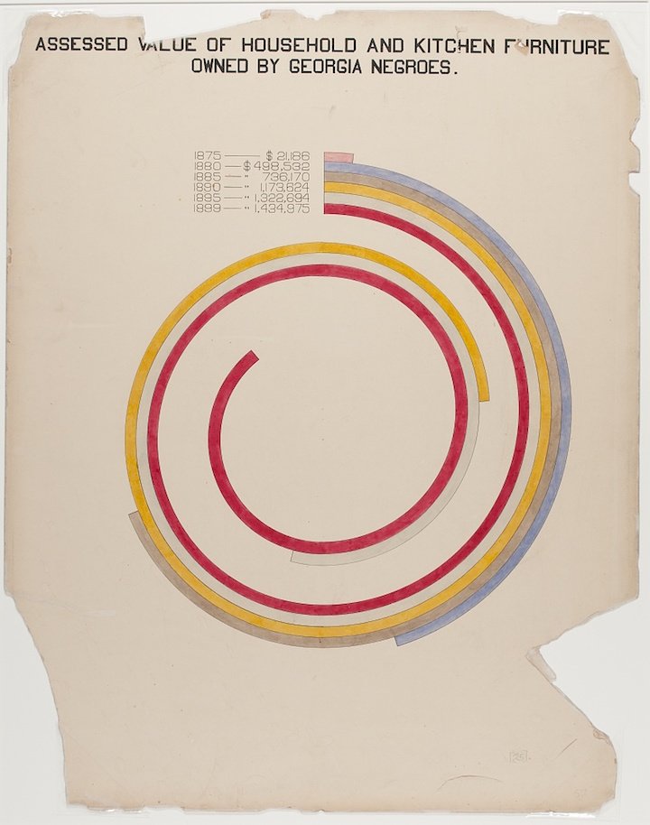
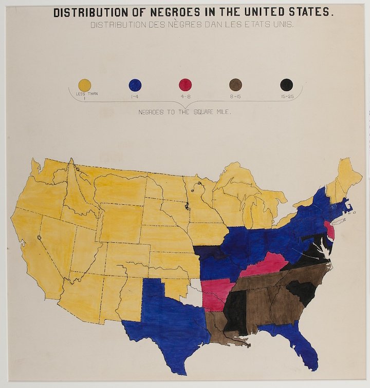
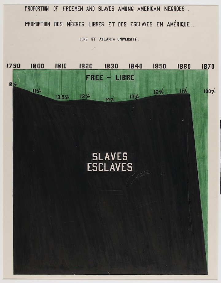
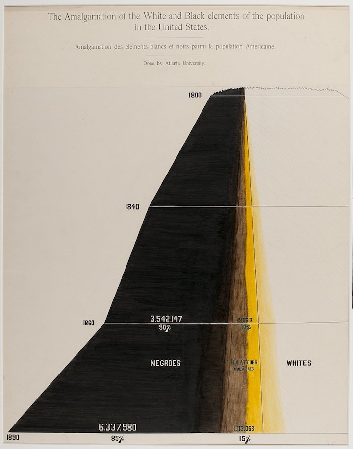
I admit that I knew and know very little about Du Bois and certainly had no idea that he created such visually unique and careful visualizations. The critic in me wants to say that some of these do not hold to modern best data viz practices, but damn, sometimes you want to get lost in a careful study of data and spend some time with beautiful meaningful graphic design. And that's what you certainly do with these visualizations.Check out all of them at Public Domain Review and as so often is the case, major h/t to Kottke.
.


I'm not always the biggest fan of heat maps, but I thought this one today from the NY Times on cabinet confirmations was particularly nice. And, of course, it's interactive on their site.

Sadly, the world lost statistician, doctor and TED personality Hans Rosling yesterday. In honor of his endless enthusiasm for and influence on data and data visualization, I put together this little tutorial on how to approximate his Trendalyzer software to create animated bubble charts using PowerPoint's morph transition.
If you haven't seen Hans present, take a look at some of my favorites:
The Best Stats you've Never Seen • 200 Countries, 200 Years, 4 Minutes • Global Population Growth, Box by Box • Asia's Rise: How and When
We're always looking to create timelines that are more interesting and more easily read. Recently a client kept talking about upcoming events that "were on the calendar," and so we decided to ditch the normal linear timeline approach and just show an actual calendar.
I like how this literally visualizes the dates rather than putting them abstractly on a horizontal line.

Ugh. New York City Mayor Bill de Blasio presented the City's new budget yesterday with a series of not ready for primetime slide-aments. Can't seem to find the full deck, but here's just one highlight.

Entirely impractical, but there's something aesthetically beautiful about these simplified maps of various subway and train lines around the world.
h/t to Kotke


I love the use of panel charts (also called small multiples), but something did seem fishy about this NY Times chart showing that millennials seem less interested in democracy these days.

Fortunately, The Washington Post checked the Gray Lady in a great analysis which included this much more truthful chart that is still a panel chart.


The Data Visualization Catalogue is an interesting new in-progress website attempting to catalog various types of data and information visualizations. Useful as a first step if you're looking for ideas or other options.
H/T to Stephy Lewis.
There are many data visualization sins, but the one that makes my blood boil is manipulating the Y-axis. Fox News is the master at this, so often just deleting the Y-axis entirely to invent the data story that syncs with the network's political narratives.While Fox News generally is creating a story that isn't there, usually when I see Y-axis shenanigans, it is to exaggerate a legitimate story. And generally, the story is a good one to begin with that doesn't need exaggeration.I was not been a big fan of the Consumer Reports redesign from a graphic design perspective, but it has slowly gotten a bit better. But the really need a stronger editor (and backbone) when it comes to data visualization. Your data tells a good story to begin with—there is no need to visually lie to your readers, as they did recently with these charts showing secondary market ticket prices. Because the length of the bars indicate value, distorting them is essentially telling an untruth to your audiences. (No, $22.58 is not one quarter as much as $36...) Just being visually truthful doesn't make your story less impactful. And if it does, then you need to get a better story! This would be a far more truthful design:
 Or, since it is a trend, I would probably suggest a line chart:

A Russian poster advising against dangerous selfie-taking.

I couldn't find the source of this data from Oxfam, but I love the simplicity of adding a visual to the numbers on this line graph.
 I came across a simple, but excellent example of process graphics in Michael Bierut's new book, How To. Above are two pages from the printed brand guidelines for the design of United Airline's once low cost sub-brand called TED.As part of the design and branding work, Michael's firm Pentagram wanted to show how the different divisions of United Airlines all fit together. Instead of a single visual ("process graphic"), they created two: one for internal audiences (on the left) and one for external audiences (on the right.)This is a great reminder for me that one story does not always mean one single graphic. Think about your audience, think about their level of knowledge, think about what you want them to take away from your graphic.Below is the full page from Michael's new book.

My fellow PowerPoint MVP, Glenna Shaw has written a great tutorial on how to create Excel table heat maps.
Generally, we think of "heat maps" as geographical, shading in countries, states or other regions to indicate relative values. But heat maps can actually much more easily be applied to Excel tables through conditional formatting—rendering a "referanceable" table into a "glanceable" visualization.


When bad slides leak and become news, presentation designers can't help themselves from redesigning them. And that's a good thing.
My friends at SlideRabbit took on Sony's recently leaked slides.

My friend and fellow PPT MVP Dave Paradi has a nice post up on how to source and use vector icons in PowerPoint when you don't have access to Adobe software.
And a few more resources for free icons are Google's Material Design icon collection, flaticon.com and thenounproject.

I'm really excited to be doing my second webinar for PresentationXpert on Wednesday, November 12.
Visualizing data effectively and clearly is becoming an increasingly larger part of workflows these days. Tune in to this free seminar to learn how to create better charts and visualizations using the tools you already have on your desktop.
We'll cover 6 solid techniques for indentifying and telling the story of your data including the all-important "McKinsey Rule."
We'll discuss "chart junk," how to identify it, why it's counterproductive and how to remove it. We'll discuss why pie charts suck, how to avoid legends and the reasons why the fewer colors you use the better.
And did I mention that the webinar is absolutely free?
Register now!