Avoiding Jargon
Someone recently showed me a pitch proposing a 3-pronged digital communications strategy for a client. "It's too complicated, and we want to make it more understandable," they said. "Can you create a visual to make it simpler?"
The ask wasn't all that unusual, and I do this kind of thing all the time. But as we talked through the content, I found myself having a great deal of difficulty understanding what was even being proposed. It wasn't highly technical language or even overly big words. The reason the proposal was complicated was not because it lacked visuals, but because it was filled with business jargon. We've all seen and probably used terms like "incentivize," "align," "impactful," "benchmark," "engagement," "dimensionalize," "silo," "synergize," and the list could go on and on. That's jargon.
Presenting a story well means presenting it simply. And just as though your visuals should be direct and sparing, so should your language—both what's on the screen and what's in your speaker notes. There's something to be said for the expression, "Explain it to me like I'm a fourth grader."
Carmine Gallo discusses the use of "amazingly zippy words" and "jargon creep" in his excellent The Presentation Secrets of Steve Jobs. You're probably sick of me continually holding Steve Jobs' keynotes as examples of good presenting, but there is simply no better high-profile presenter today than Apple's CEO. And he excels at simple, jargonless language. Here's a slide that Joe Businessman might have created for an Apple iPod release...
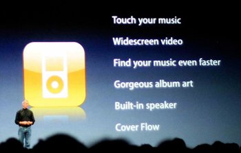
At first glance, many of you might be at a loss as to how to simplify this, and may even question that it uses jargon at all. Now take a look at the actual slide Steve presented...
It's not only simpler language, but every word speaks to what people actually care about. "Powerful search functionality" might sound impressive, but what does it actually mean? Nothing, until it's presented clearly: "Find your music even faster."
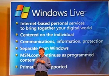
Compare Steve's slide with one from a Microsoft presentation. While there may not be any single complicated word, there are far, far too many on the screen, and the mesage is far from clear.
The plain English movement is often seen as avoidance of technical language in the sciences, legal and governmental arenas. That's all important, of course, but just because you're not using Latin, doesn't mean that you can't make your on-screen text even simpler than it is. Next time you create a slide, find a child under ten to show it to. If he or she can understand what you're saying, you just might have something.
I also want to take the opportunity to point out a fantastic text analysis tool at a site calledUsingEnglish.com. You can paste in a block of text and get an instant analysis. The varied metrics will tell you just how complex your writing is. My favorite metric included is theGunning Fog Index which will give you a "fog" value for your writing. The higher the rating, the more complex your writing and the harder it will be for your audience to understand. Gallo has a nice language complexity comparison of speeches by Steve Jobs versus those by Bill Gates. For two selected speeches, Steve clocked in with a fog index of 5.5 while Bill topped out at 10.7. For the same speeches, Steve averaged 10.5 words per sentence, while Bill had 21.6, and Steve averaged 2.9% "hard words" while Bill used 5.11%.
Don't make it stupid. Make it simple..., stupid.
Oh, and just so you know that I don't think Steve always gets it right, take a look at this compilation of Apple Keynote bloopers. There's a sequence about 1:50 in which Steve shows exactly how bad jargon can get. But, of course, to his credit, he instantly recognize his mistake, makes an apology, makes a joke and translates the jargon. "We built in a technology in the Mac OSX mail called Adaptive Latent Semantic Analysis. Now what is this? I don't know, but it works!"


